
Introduction
Welcome to part 2 of the "Getting Started" guide for Vodafone Analytics on the Developer Marketplace. In this guide, we'll continue from where we left of in part 1 and look at using interactive maps for visualising the data produced by our advanced analytics tools.
Pre-requisites
This guide assumes you are continuing from where part 1 ended. If you have ended that session, then you can follow the "Setup" section below to resume the analysis.
Setup
You can run these commands to resume your session:
# Run the activation script to configure the shell environment
source vfa/bin/activate
# Run jupyter notebooks
jupyter notebook
A new page should open in your browser. In it, click on the file that was created in the previous tutorial. in this case, it is the "Untitled.ipynb" displayed on the image below:
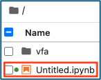
Figure 1: reopening a Python notebook file
It should already contain all the variables and helper functions created during the last run through. In case it doesn't, here they are:
import pandas as pd
import geopandas as gpd
import mercantile
from shapely.geometry import Polygon
import matplotlib.pyplot as plt
import contextily as ctx
import folium
from folium.plugins import HeatMap
import plotly.express as px

# Specify the path to your CSV file
CSV_FOOTFALL_FILE = './footfall-measures_20240701_20240731_starter.csv'
CSV_FOOTFALL_AGG_FILE = './footfall-measures_20240701_20240731_starter-agg.csv'

EXPORT_HEATMAP_FILE = './vfa_heatmap.html'
EXPORT_CHOROPLETH_FILE = './vfa_choropleth.html'

# Helper functions
# Function to calculate the centroid of a quadkey
def quadkey_to_lat_lon(quadkey):
    # Convert quadkey to tile
    tile = mercantile.quadkey_to_tile(quadkey)
    # Get the bounding box of the tile
    bounds = mercantile.bounds(tile)
    # Calculate the center of the tile
    lat = (bounds.north + bounds.south) / 2
    lon = (bounds.east + bounds.west) / 2
    return lat, lon

# Function to convert a quadkey to a polygon
def quadkey_to_polygon(quadkey):
    # Convert quadkey to tile coordinates
    tile = mercantile.quadkey_to_tile(quadkey)
    # Get bounding box for the tile
    bounds = mercantile.bounds(tile)
    # Create a polygon from the bounding box
    return Polygon([
        (bounds.west, bounds.south),  # Bottom left
        (bounds.west, bounds.north),  # Top left
        (bounds.east, bounds.north),  # Top right
        (bounds.east, bounds.south),  # Bottom right
        (bounds.west, bounds.south)   # Close polygon
    ])

# Function to calculate the best map zoom level given a dataframe of latitude and longitude points
def map_zoom_level(df):
    # Calculate the range between map locations
    lat_range = df['latitude'].max() - df['latitude'].min()
    lon_range = df['longitude'].max() - df['longitude'].min()

    #Determine a suitable zoom level, adjusting the constant factor as needed
    if max(lat_range, lon_range) < 1:
        zoom_level = 10  # Higher zoom level for small area
    elif max(lat_range, lon_range) < 5:
        zoom_level = 6  # Medium zoom level for medium area
    else:
        zoom_level = 4  # Lower zoom level for large area

    return zoom_level+3

df = pd.read_csv(CSV_FOOTFALL_FILE, dtype=str)
df['measure_value'] = pd.to_numeric(df['measure_value'])

# Remove the daily entries and keep just the hourly ones
df['measure_granularity'] = df['time_aggregation'].apply(
	lambda x: 'daily' if len(x) == 10 else 'hourly'
)
df = df[df['measure_granularity'] != 'daily']

df_agg = pd.read_csv(CSV_FOOTFALL_AGG_FILE, dtype=str)
df_agg['measure_avg'] = pd.to_numeric(df_agg['measure_avg'])
df_agg['measure_max'] = pd.to_numeric(df_agg['measure_max'])

# Create the extra supporting columns used for mapping
df_agg[['latitude', 'longitude']] = df_agg['dst_id'].apply(quadkey_to_lat_lon).apply(pd.Series)

# Creating a new column with geometry data
df_agg['geometry'] = df_agg['dst_id'].apply(quadkey_to_polygon)

# Top 10 busiest tiles by their average footfall
df_top_10_avg = df_agg.sort_values(by='measure_avg', ascending=False).head(10)

# Top 10 busiest tiles by their maximum footfall
df_top_10_max = df_agg.sort_values(by='measure_max', ascending=False).head(10)
Now our session is ready to continue.
Analysing overlapping results
Observant readers may have noticed that in the resulting map from the first guide, out of a possible 20 tiles (top 10 average and top 10 maximum), only 14 were present. As a reminder, here is that map:
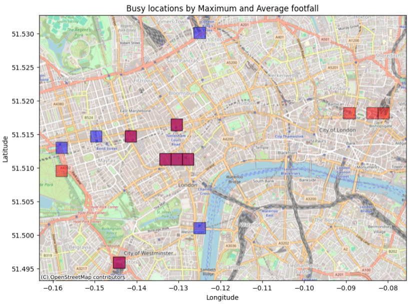
Figure 2: resulting map from first tutorial
This section will show how to drill down into the dataset to flesh out overlapping results.
The next code snippets will detail how to merge the dataframes on the "dst_id" field, allowing the intersections to be visible.
# Merge DataFrames on 'id' to find common values
common_ids = pd.merge(df_top_10_avg, df_top_10_max, on='dst_id')
print('there are {} common IDs that appear in both datasets'.format(len(common_ids)))
there are 6 common IDs that appear in both datasetsHere are the details of the quiadkeys appearing in both dataframes:
common_idsdst_id measure_min_x measure_max_x measure_avg_x latitude_x longitude_x geometry_x measure_min_y measure_max_y measure_avg_y latitude_y longitude_y geometry_y
0 03131313111232022 4806 83226 35277.0 51.516434 -0.130463 POLYGON ((-0.1318359375 51.51557978375592, -0.... 4806 83226 35277.0 51.516434 -0.130463 POLYGON ((-0.1318359375 51.51557978375592, -0....
1 03131313113001233 5116 68560 33165.0 51.495920 -0.144196 POLYGON ((-0.14556884765625 51.49506473014369,... 5116 68560 33165.0 51.495920 -0.144196 POLYGON ((-0.14556884765625 51.49506473014369,...
2 03131313111232220 6423 81998 30680.0 51.511307 -0.130463 POLYGON ((-0.1318359375 51.510451886248575, -0... 6423 81998 30680.0 51.511307 -0.130463 POLYGON ((-0.1318359375 51.510451886248575, -0...
3 03131313111232221 4666 85729 30605.0 51.511307 -0.127716 POLYGON ((-0.12908935546875 51.510451886248575... 4666 85729 30605.0 51.511307 -0.127716 POLYGON ((-0.12908935546875 51.510451886248575...
4 03131313111223300 2411 75081 30510.0 51.514725 -0.141449 POLYGON ((-0.142822265625 51.513870548723986, ... 2411 75081 30510.0 51.514725 -0.141449 POLYGON ((-0.142822265625 51.513870548723986, ...
5 03131313111223331 5578 74285 28956.0 51.511307 -0.133209 POLYGON ((-0.13458251953125 51.510451886248575... 5578 74285 28956.0 51.511307 -0.133209 POLYGON ((-0.13458251953125 51.510451886248575...
With this information, you can now plot the individual hourly values of the common ids over the entire month on a chart.
# Use the common ids from above to look at the hourly counts over the month
ids = common_ids['dst_id']

# Create a new dataframe based only on the common ids
df_hourly_tile = df[df['dst_id'].isin(ids)]

# Drop the columns we don't need and sort out the remaining ones by the 'time_aggregation' column
df_hourly_tile = df_hourly_tile.drop(columns=['dst_unit', 'measure_name']).sort_values(by='time_aggregation', ascending=True)

# Create an interactive line chart using Plotly
fig = px.line(df_hourly_tile, x='time_aggregation', y='measure_value', color='dst_id', markers=True, labels={'time_aggregation': 'Time Aggregation (Hourly)', 'measure_value': 'Measure Value'}, title='Interactive Line Chart of Measure Value by dst_id')

# Update layout for better visuals
fig.update_layout(xaxis_title='Time Aggregation (Hourly)', yaxis_title='Measure Value', legend_title='dst_id', xaxis=dict(tickangle=45))

# Show the interactive plot
fig.show()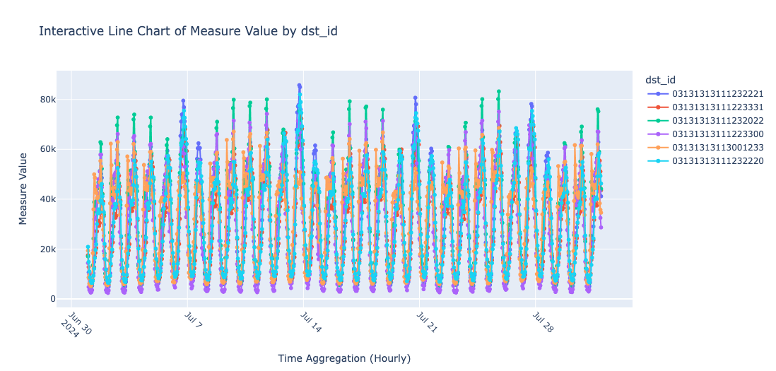
Figure 3: line chart of the hourly values of the common ids
Plotting interactive maps
While the map shown in figure 2 provides a good visualisation of the subset of data extracted from the starter file, it doesn't offer much detail as users are not able to zoom in or out or move around it.
In this section, the tools that can provide a more interactive visual experience for the users will be introduced. To do this, the Folium map package is used, allowing all the files from the dataset to be displayed as a heatmap. Other mapping libraries can also achieve similar results, depending on personal preference. The output can also be exported as an HTML file to be loaded in a browser.
Since all the tiles are going to be analysed, let's refer to the original 'df_agg' dataframe loaded in earlier.
# User CartoDB Positron grayscale custom layer

# Example URL: Using 'CartoDB Positron' as a light grayscale alternative
custom_tile_url = 'https://{s}.basemaps.cartocdn.com/light_all/{z}/{x}/{y}.png'

# Calculate the best map zoom level
zoom_level = map_zoom_level(df_agg)

# Prepare data for heatmap
heatmap_data = df_agg[['latitude', 'longitude', 'measure_max']].dropna().values.tolist()

m = folium.Map(location=[df_agg['latitude'].mean(), df_agg['longitude'].mean()], zoom_start=zoom_level, tiles=custom_tile_url, attr='CartoDB Positron')

# Add a heatmap layer
HeatMap(heatmap_data, min_opacity=0.5, radius=15, blur=10).add_to(m)

# Save to HTML and display
m.save(EXPORT_HEATMAP_FILE)
m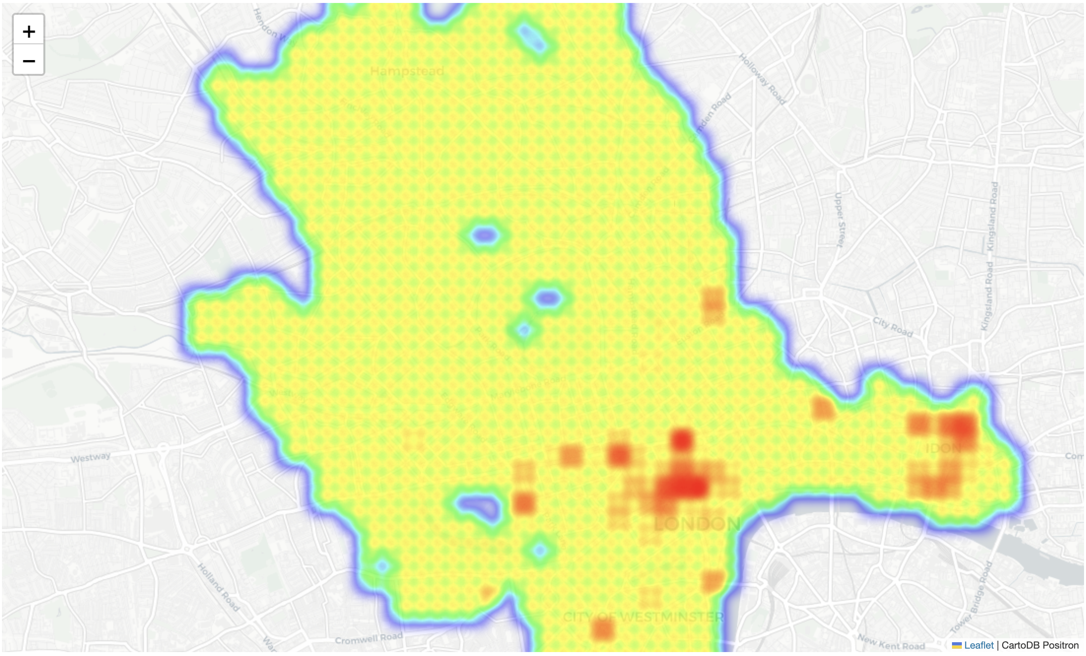
Figure 4: screen capture showing heatmap
The Folium map allows readers to interact with the data and zoom in to see the busiest areas. Two key clusters standout: Soho and Covent Garden (popular with both national and international tourists), and Bishopsgate, where Liverpool Street station is located (a popular hub for commuters and visitors).
Folium also provides a Choropleth map, which is excellent for presenting measures against different-sized areas.
For this next step, let's separate the geographic data from the measurement data:
# Prepare the GeoJson data - We will split the spatial and the measurements into 2 separate dataframes;
# If you are using 3rd party geojson data in the future you will be able to use those files or URIs to provide the geometry objects.

# Calculate the desired zoom level, create the map and add the data layer
map_latitude_center, map_longitude_center = df_agg['latitude'].mean(), df_agg['longitude'].mean()
zoom_start = map_zoom_level(df_agg)

# Split the 'data' and 'geo_data' into 2 separate data frames
spatial_cols = ['dst_id', 'geometry', 'latitude', 'longitude'] # columns for the geopsatial dataframe
measurement_cols = ['dst_id', 'measure_avg']

# Create the geo data frame and use the projection 4326 (WGS84)
geo_data = gpd.GeoDataFrame(df_agg[spatial_cols].copy(), geometry='geometry', crs='EPSG:4326')
data = df_agg[measurement_cols]

# Create a Folium map
m = folium.Map(location=[map_latitude_center, map_longitude_center], zoom_start=zoom_start, tiles='CartoDB Positron')

# Add a Choropleth map
folium.Choropleth(
	geo_data=geo_data.to_json(),
	name='Choropleth',
	data=data,
	columns=['dst_id', 'measure_avg'],
	key_on='feature.properties.dst_id',
	fill_color='YlOrRd',
	fill_opacity=0.2,
	line_opacity=0.1,
	legend_name='Measure Value',
).add_to(m)

# Add layer control
folium.LayerControl().add_to(m)

# Save to HTML and display
m.save(EXPORT_CHOROPLETH_FILE)
m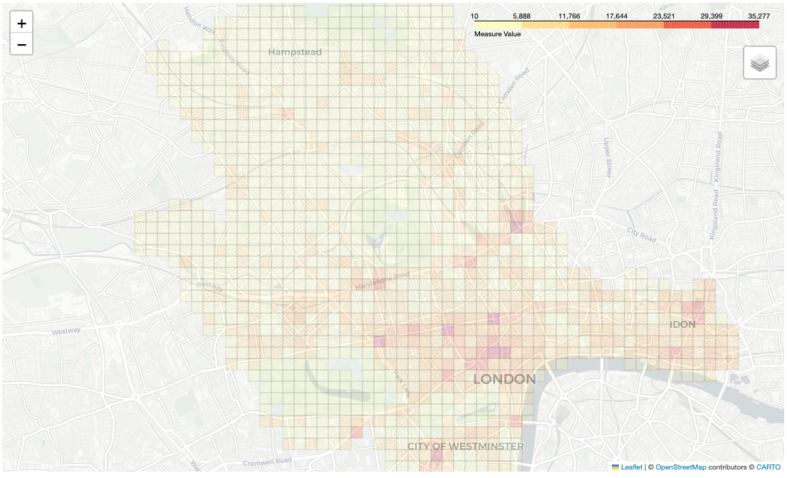
Picture 5: screen capture showing the Choropleth map
Changing the size of the tiles
Now the quadkeys will be aggregated to demonstrate a powerful feature of using tiles over some other coordinate systems. To move up a level (reduce the zoom level), simply remove the last digit from the "dst_id". For example, a quadkey-17 contain 17 digits while a quadkey-15 contains 15 digits, and so on.
A new column called "dst_id_agg" can be created and moved up two zoom levels to showcase this:
# Here is how to create the new column: using a default zoom level of 15, zoom levels can be experimented with where the muber is smaller than 15
zoom_level = 15
df_agg['dst_id_agg'] = df_agg['dst_id'].str[:zoom_level]
df_agg.head(5)
dst_id measure_min measure_max measure_avg latitude longitude geometry dst_id_agg
0 03131313110133133 18 50 32.0 51.571095 -0.177155 POLYGON ((-0.17852783203125 51.570241445811234... 031313131101331
1 03131313110133230 10 141 44.0 51.565973 -0.190887 POLYGON ((-0.1922607421875 51.56511970412417, ... 031313131101332
2 03131313110133231 35 701 279.0 51.565973 -0.188141 POLYGON ((-0.18951416015625 51.56511970412417,... 031313131101332
3 03131313110133232 51 178 96.0 51.564266 -0.190887 POLYGON ((-0.1922607421875 51.563412328675874,... 031313131101332
4 03131313110133301 89 583 413.0 51.569388 -0.182648 POLYGON ((-0.18402099609375 51.56853426269097,... 031313131101333
The response for the above shows the difference between the "dst_id" and the "dst_id_agg" columns: one has a length of 17 while the other has 15.
Next, create the new qk15 level dataset.
Note: this is not the proper way to achieve this in a production environment (doing an average of an average), but it is being used here to demonstrate functionality. Alternatively, you can use the original dataset and create a new column.
# Creates aggregates for minimum, maximum, mean (average)
df_agg_qk15 = df_agg.groupby('dst_id_agg', as_index=False).agg(
	measure_min=('measure_min', 'min'),
	measure_max=('measure_max', 'max'),
	measure_avg=('measure_avg', 'mean')
)

# Convert the mean average to a whole number
df_agg_qk15['measure_avg'] = df_agg_qk15['measure_avg'].round(0)

# Check the first 5 rows
df_agg_qk15.head(5)
dst_id_agg measure_min measure_max measure_avg
0 031313131101331 18 50 32.0
1 031313131101332 10 701 140.0
2 031313131101333 10 3394 384.0
3 031313131103100 727 2186 1341.0
4 031313131103101 134 3944 1542.0
Now, enrich the dataframe with geometry values, then split it, ready for mapping:
# Creating a new column with geometry data
df_agg_qk15['geometry'] = df_agg_qk15['dst_id_agg'].apply(quadkey_to_polygon)

# Create the lat and lng columns - used for working out the view point for the map
df_agg_qk15[['latitude', 'longitude']] = df_agg_qk15['dst_id_agg'].apply(quadkey_to_lat_lon).apply(pd.Series)

# Split the 'data' and 'geo_data' into 2 separate data frames
# Columns for the geospatial dataframe
spatial_cols = ['dst_id_agg','geometry', 'latitude','longitude']
measurement_cols = ['dst_id_agg','measure_avg', 'measure_max']


# Create the geo data frame and use the projection 4326 (WGS84)
geo_data = gpd.GeoDataFrame(df_agg_qk15[spatial_cols].copy(), geometry='geometry', crs='EPSG:4326')
data = df_agg_qk15[measurement_cols]
Finally, plot the aggregated tiles on a map:
# Create a Folium map
m = folium.Map(location=[df_agg_qk15['latitude'].mean(), df_agg_qk15['longitude'].mean()],
	zoom_start=zoom_start,
	tiles='CartoDB Positron')

# Add a Choropleth map
folium.Choropleth(
	geo_data=geo_data.to_json(),
	name='Choropleth',
	data=data,
	columns=['dst_id_agg', 'measure_avg'],
	key_on='feature.properties.dst_id_agg',
	fill_color='YlOrRd',
	fill_opacity=0.8,
	line_opacity=0.5,
	legend_name='Avg',
).add_to(m)

# Add layer control
folium.LayerControl().add_to(m)
m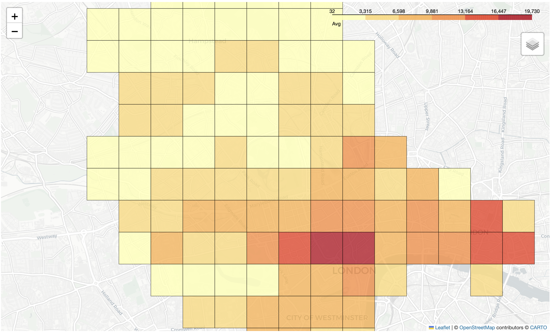
Figure 6: screen capture showing the Choropleth map, now with 2 zoom levels up
The aggregated results at quadkey-15 show the same trends as quadkey-17, but the tiles in figure 6 are noticeable larger than those in figure 5, which follows the established premise.
Summary
Congratulations! You've now completed this guide for exploring insights of the starter data set using interactive maps. Be sure to check out future guides and blog posts to see how other companies and academia are using these valuable data sources.
Don't forget to register your interest by filling out and submitting the form located here. That ensures you can stay up to date with the latest on Analytics and other APIs offerings. It is also a great way to get in touch with us.
See you around!
